Logo and identity
The Brand
- Group
- Who we are
- About our Group
- Logo and identity
The Group's visual identity
Hera is a multi-utility that has been able to implement a growth strategy that, since 2002, has doubled the size of the Group and the results of its operations, enabling the entry of new partners and the creation of new companies. Hence it is essential to have a consistent and flexible visual identity system through which the distinctive features of the Group's image can be applied to each company.
The brand takes on a strategic value.
The Group's logo, strong and distinctive, communicates and consolidates the company's identity

Symbols, dynamism, and colours
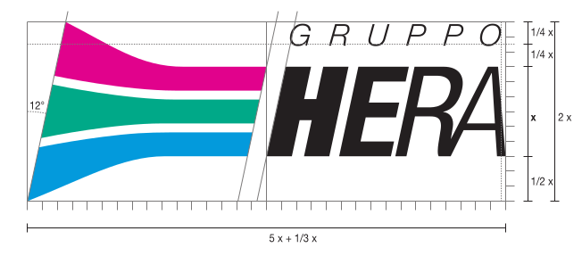
Since the beginning, the reference logo has been that of Hera–Holding Energia Risorse Ambiente, created in the autumn of 2002 by Dutch graphic designer Bob Noorda, the author of many well-known logos such as those of Enel, Pirelli, Eni, Rinascente and Metropolitana di Milano.
It is a combined logo, built with four letters in Helvetica font inclined in a decreasing sequence that express dynamism and a pictogram modulated in three symbolic elements, coloured differently to represent respectively energy (magenta), environment (green), and water (blue).
In the architecture of the Group's brands, in some cases, such as Herambiente and Hera Comm, their visual identity is also linked to their naming, while for other companies the reference to the Hera Group, as in the case of Uniflotte, is done by using the Helvetica font and the colours of the main logo.
Our special logos

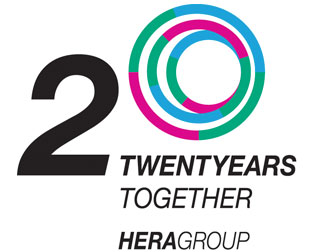
Important anniversaries are celebrated with a memorable symbol: and to celebrate Hera Group’s 20th anniversary, we have created a brand to make this milestone even more special. With this logo, we want to convey inclusiveness, closeness and sharing, commitment and responsibility, and our roots in the territory. The creative concept focuses on people and their central role in building the present and planning the future.
"Twenty years together", the claim, strengthens the participatory character with which all stakeholders, citizens, customers and the workers of Hera Group identify themselves. The number 20 is in the colours of the Group's businesses, emphasising Hera’s nature as a multi-service and the dynamism that has allowed us to grow together with the communities where we work. Three decentralised rings form the zero, in a composition that conveys solidity and fluidity, with a strong drive forwards, towards the future, where tradition and innovation go hand in hand.
The colours of the rings are the colours of energy, water and the environment, to emphasise the identity of Hera Group and the purpose for which we exist: to offer water, energy and environmental services with a business model which creates value that we share with our stakeholders, promoting social equity and contributing to achieving carbon neutrality, the regeneration of resources and the resilience of the system of the services managed, for the benefit of customers, the ecosystem of the territory and future generations.

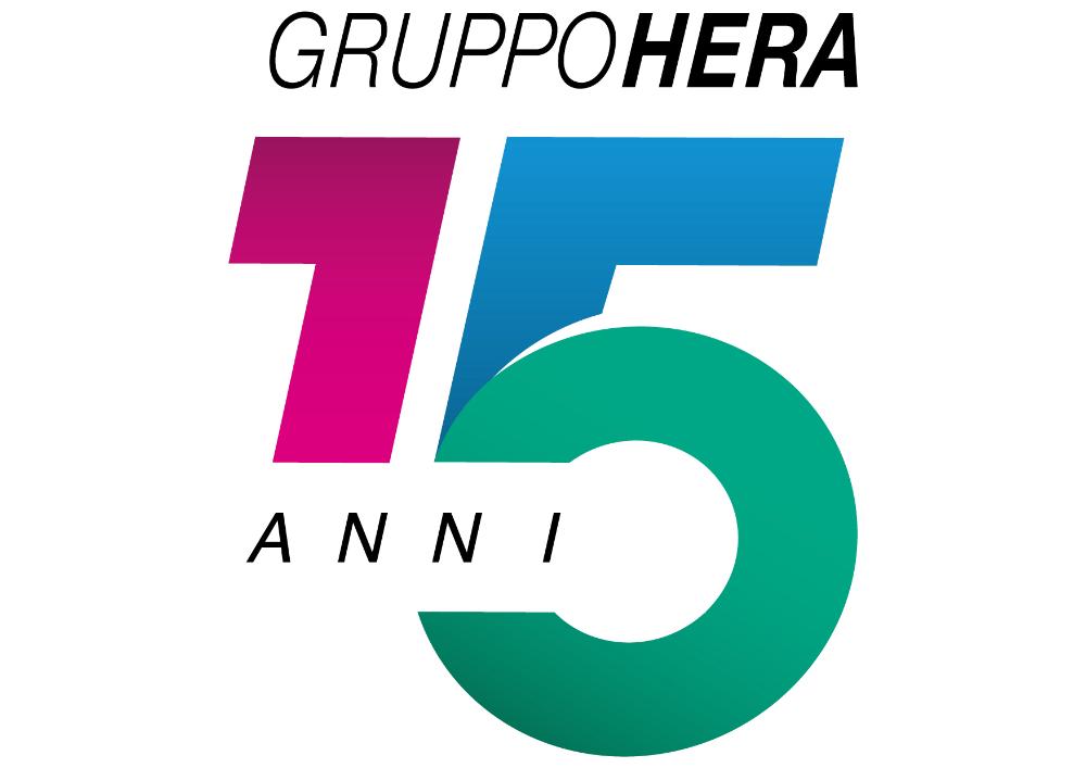
A celebration must be etched in our memory in order to firmly consolidate the emotions and values that characterize it. Hera Group's 15th anniversary, in November 2017, deserved a special logo.
The starting point was its three distinctive colours, recombined to form the number "15", slightly inclined to express dynamism, aspiration towards excellence and orientation towards the future. Moreover, with its round shape, the numeral "5" reflects the concept of Circular Economy, a new paradigm of development to which the Group is committed, to increase the shared value for the company, for society and the environment.

This logo represented an important visual milestone in the success of the Group's history.
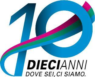
On the company's tenth anniversary, in 2012, a "special" logo was created to accompany Hera Group's institutional logo throughout the year.
The tenth anniversary was an opportunity to implement several initiatives aimed at creating a sense of belonging and cohesion among all workers in relation to the Group, valuing all the people who have contributed to its foundation and development.
Legal aspect
Hera is a registered trademark of the holding company Hera S.p.A.
Any unauthorized use of the aforementioned trademark and its derivatives or, in any case, of the Hera name in any context and/or associated with other terms, graphic symbols, or signs of any kind, will be prosecuted by law.
The Hera Group trademark may only be used, subject to authorization, by Group companies that meet two requirements:
- the company must be a direct or indirect subsidiary of Hera S.p.A.
- the company must be present in the consolidated financial statements of the Group prepared by Hera S.p.A.
Company trademarks in the various areas of application (printed matter, signs, advertisements, company vehicles, waste containers, web, headed forms, etc.) must only be used in compliance with the coordinated image system and agreed with Hera S.p.A., External Relations.
Sending the trademark outside the company also requires prior authorisation.
Page update 20 January 2025
and Creating Shared Value 2025

